Showing posts with label interior design. Show all posts

Friday, 22 April 2016

New AndTradition Lighting 2016 in Hong Kong

New this year from &tradition is the Passepartout light designed by Spanish designer Jaime Haydon.


Whether you need lighting for a large, expansive space or a narrow corridor, for a cosy home environment or a welcoming workspace, the Passepartout Lamp emits a light that’s surprisingly calm and tranquil. Add to that built-in LED technology that ensures a high quality light emission that’s also energy-efficient, custom designed so the light is uniformly dispersed throughout a space. 


It's available in white and black as well as brass and polished aluminium.  


Jaime Haydon has also lent his design talent to the Formakami lamps


The Paper Lantern series is comprised of three different versions in ivory white rice paper with black stained oak accents in sizes from 46 cm in diameter to 70 cm. Each weighing only 1 kilo, they hang delicately in any indoor setting. Living proof that when East and West meet, the past becomes the present in a poetic expression of both.
Dating back centuries, paper lanterns have featured in Asia amongst the privileged and the poor, where different colours, shapes and sizes connote different meanings. Here Hayon has dispensed with cultural formalities to create a series of lanterns all in white. Hand crafted with rice paper merging various sizes and shapes together.


They look amazing in clusters.   

We'll soon have some samples in store for you.   Check back soon.   


Thursday, 21 April 2016

Choosing tiles and bathroom fittings

One of the most fun parts of any interior design is choosing the bathroom fixtures and fittings.   I love colour, but in my own house I tend to avoid it, fearing that after some time I will get sick of it.

Our house will have a bit a country feel but we are using very contemporary fixtures but with some classic additions.

We're keeping the palette black and white with a touch of grey.

I want to use hand cut tiles, marble, concrete and leather as the material palette.


via

This is one of my inspiration images for the bathroom.  I like the black tapware and the free standing cabinet.   

The first thing I chose was the basin.  


This basin  fits the bill for a few reasons.  You can see that the interior of the bowl has rounded corners which is great for cleaning purposes.   We are also able to powder coat the rail black as we are using black tap fittings.   

We're going to use the CityPlus range of tapware.   It is shown here in a bronze finish but we are going to specify black.  


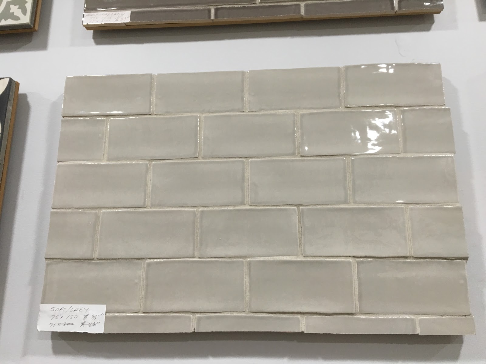
Here is the type of handcut tiles we are using- I love the rough texture of this for a country property.   


We're mixing it with a calacutta marble subway tile... or even a hexagonal marble mosaic


Which will end up looking a bit like this...


We want to use a dark grout- it's very practical for cleaning purposes and the contrast can look stylish....

I like 503 which happens to be mould and fungi resistant as well.  


The finished result will be something like this....

Friday, 15 April 2016

Oops...forgot to post

I've been a bit lazy these past few days/weeks.  We've been travelling a lot and have just been down to the house in Berry to oversee the start of construction.   When we arrived, the lawn was around 50 cm high and we spent the first few hours on the Hustler trying to tame it.  

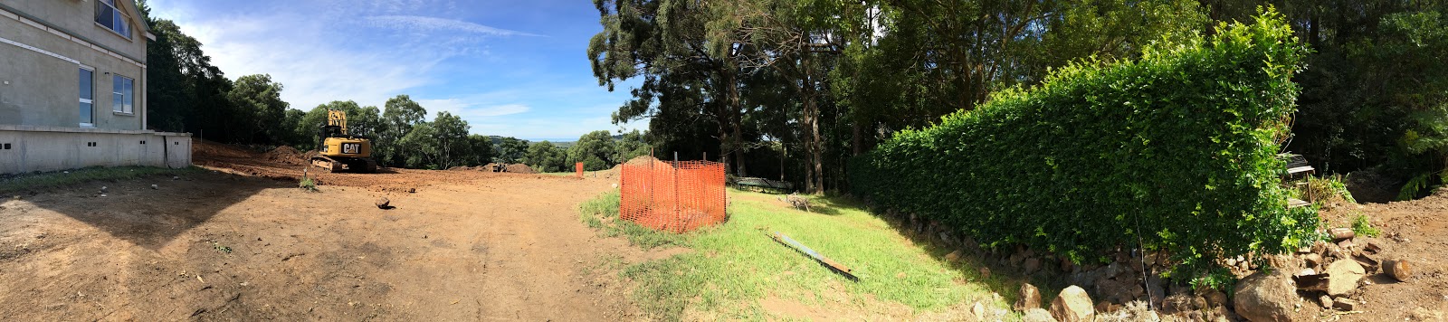
The next day the workers showed up....and after 4 days it looked like this.... so glad we made the effort to mow the lawn.  


a fabulous panorama of the old house...


The fabulous Ryan turned up in his bulldozer (?) - what are these called?  and ripped out all the lawn, quite a few trees and most of the hedges.  


We are leaving the existing house in situ while we construct the new house.   However as verandah of the old house overlaps the site of the new one, we have to remove the verandah.   A concrete saw was used to cut through the existing verandah and holes drilled into it.  It will then be attached to some sort of machinery and pulled off.  


Here's another view of the old house...

One of the best things about living overseas is not having to watch this building process day by day.   Considering it's going to take around a year to construct, it will be too painful to watch...


Sunday, 27 March 2016

HAY office furniture...lithuania

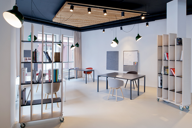
One of the best investments you can make for any growing business is a cohesive office design.   HAY produces one of the best ranges of comfortable office furniture around.  Here's a quick look at one of the latest projects.


The modularity of HAY products make it easy to mix and match the designs to produce a flexible interior that can be easily added onto for your growing business.   


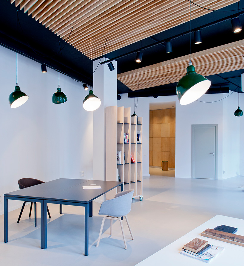
We like the simple colour scheme and the addition of warm wooden accents in the chair legs and the ceiling details.   The simple colour scheme of pale greys with punches of colour in the green vintage lighting.   


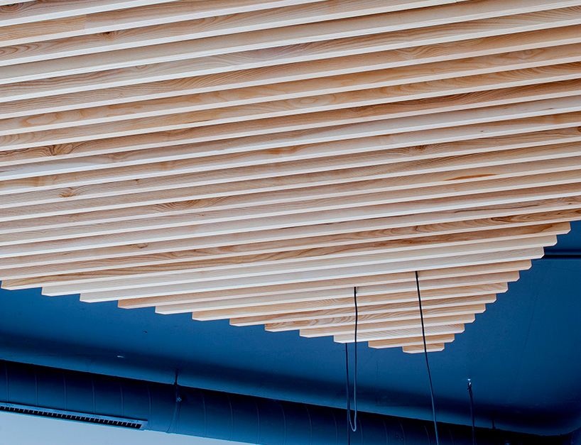
Wooden ceiling lathe detail to hide electrics and other equipment behind. 


Thursday, 24 March 2016

this weeks products in the wild

This week, we're revisiting some of our best sellers- we have always loved the price and practicality of HAY's loop stand range.   The images below are of the less used loop stand trestle table mounts.   So practical and we love the black with the white- lot's of graphic punch.   


We've almost sold out of HAY tray tables this month. They are well priced and look great in contemporary environments.  We like them situated between 2 chairs, or beside beds  too.  


We love the mix of colours in this image from the Design Files.   The orange Dinosaur design plate really looks fabulous against the blue of the wall.


Another oldie but a goodie.   We like Northern Lighting's Bender light because it is light but fun.  It is also extremely functional.  


Northern lighting's Acorn light looks great above the black tables and chairs from HAY in this office cafeteria in Oslo.   It's not too obvious here but the Acorn lamp is has a beautiful wooden finial at the top of the light.   


Gosh, Hay products are popular- the About a Lounge is really a  comfy chair and a great price too.   We have lots of samples of fabrics for you to choose from.  


Friday, 12 February 2016

Paint colours and all that

One of the most frustrating things about living in HK is the quality of the light.   As a designer, the colour of light can change the most beautiful of paint colours- so that the most subtle tones are rendered drab and lifeless.  

I love the subtlety of Farrow and Ball's paint colours from the UK.   Altfield used to carry the colours but no one ordered them (probably due to the crazy shipping prices).   However, I bit the bullet a few times and did make an order, only to be thoroughly disappointed with the results.  

However, though they didn't work in HK, it's nice to look at the new colours they introduce every season and dream.  


First up , Peignor 286, a soft subtle pink with a grey undertone.   It is inspired by the colour of chiffon dressing gowns.  You can't get more romantic than that!  

Love this colour, called Salon Drab 280.  


This is a classic 19th century drab which works well with yellows and reds.   

Love a toned down avocado green? - here is Yeabridge Green, named after the house in Somerset where it was originally found.  


Here's a lovely blue- Inchyra Blue (pronounced with a soft 'ch' like in China).   It can read as quite grey depending on the light and the juxtaposed colours.   


Remember the X-files?   They used to have an enigmatic character called Cromarty.  Alas, this colour is not named after him...Basically a neutral, it can sometimes read as blue.   


I'm quite fond of this colour. Called Worsted, it is inspired by a woollen fabric used for suits.  It reads as a clear grey.   


Drop Cloth can seem quite plain, but it is inspired by the plain cotton canvases that painters have put down to protect floors.  I like it with the wicker/straw/hide palette in the picture- I think it would work well with a scandi / heritage interior.    

Gosh, colour is an amazing thing- wish it worked better in HK.   


Friday, 5 February 2016

Fabulous fabric patterns by Christopher Farr.

There are always some classic fabric patterns that look good anywhere.  One of our favourite fabric designers is Christopher Farr.
Here are a few of our favourites...you can source all these fabrics through us.


I'm not a huge fan of foliate patterns but this Christopher Farr design is one of my favourites.   It's called Carnival and the green and blue colourway is one of the classic combinations.   

Here's another by Christopher Farr- It's called Breakwater.   


It looks fabulous in a headboard or as wallpaper as shown here.   


This image is from one of Kit Kemp's hotels.  The pattern on the headboard is from the fathom series and the curtains on the windows are from the RickRack range.  Kit Kemp designed this fabric and it is really lovely.   Again the patterns are beautifully graphic with strong colours and a lovely transition of colours within the colourway.   I love the mix of patterns.    

We will be ordering some Christopher Farr fabrics soon and making them into cushions and some other small items.   Let us know if you are interested.