
I love the subtlety of Farrow and Ball's paint colours from the UK. Altfield used to carry the colours but no one ordered them (probably due to the crazy shipping prices). However, I bit the bullet a few times and did make an order, only to be thoroughly disappointed with the results.
However, though they didn't work in HK, it's nice to look at the new colours they introduce every season and dream.

First up , Peignor 286, a soft subtle pink with a grey undertone. It is inspired by the colour of chiffon dressing gowns. You can't get more romantic than that!
Love this colour, called Salon Drab 280.

This is a classic 19th century drab which works well with yellows and reds.

Love a toned down avocado green? - here is Yeabridge Green, named after the house in Somerset where it was originally found.

Here's a lovely blue- Inchyra Blue (pronounced with a soft 'ch' like in China). It can read as quite grey depending on the light and the juxtaposed colours.

Remember the X-files? They used to have an enigmatic character called Cromarty. Alas, this colour is not named after him...Basically a neutral, it can sometimes read as blue.

I'm quite fond of this colour. Called Worsted, it is inspired by a woollen fabric used for suits. It reads as a clear grey.

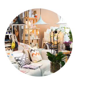
Drop Cloth can seem quite plain, but it is inspired by the plain cotton canvases that painters have put down to protect floors. I like it with the wicker/straw/hide palette in the picture- I think it would work well with a scandi / heritage interior.
Gosh, colour is an amazing thing- wish it worked better in HK.


No Comments Yet, Leave Yours!