Sunday 28 February 2016

Our products around the net


the Grasshopper in black or charcoal grey always looks great in a scandi enviroment!

via
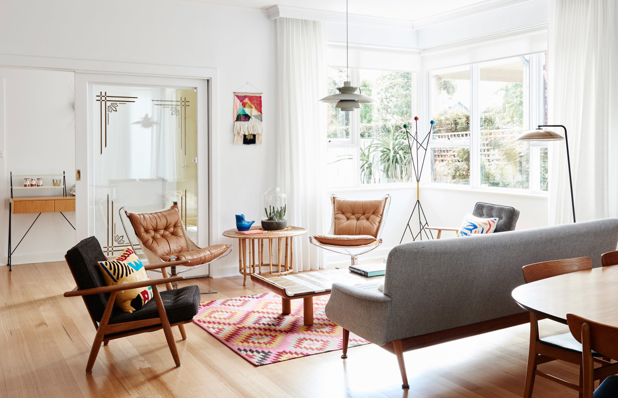
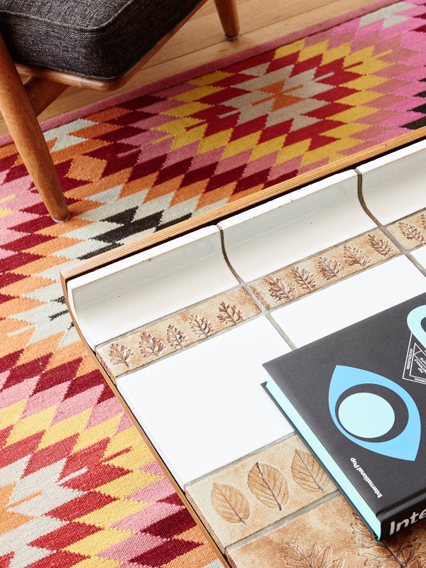
armadillo kilim weave rug armadillo kilim weave rug from the design files


another gubi grasshopper-this time in blue 
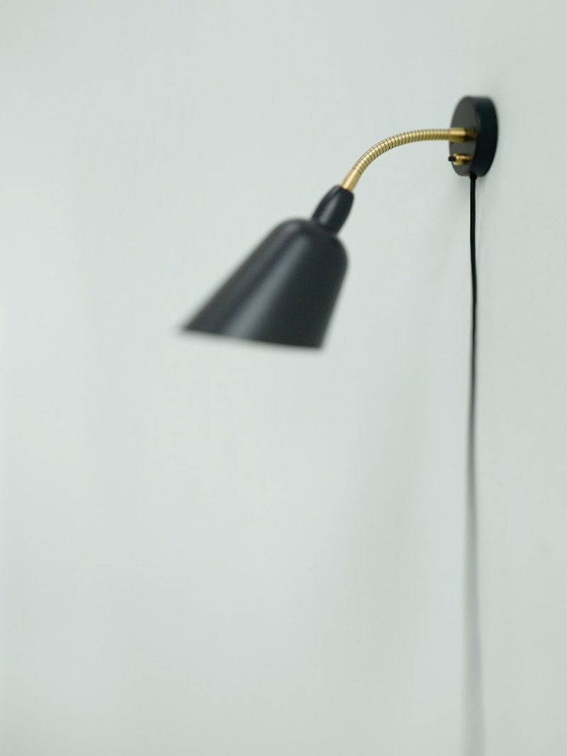
The iconic Gräshoppa lamp was first produced in 1947. The tubular steel tripod stand is tilted backward and the elongated aluminium conical shade is ball-jointed onto the arm; so the light can be directional, yet the glare is minimal. Both stand and shade are powder-coated. The classic Cobra lamp takes its name from the shape of the oval shade, which is reminiscent of a Cobra's neck. The tubular flexible arm can be bent in all directions and the shade can be rotated through 360º. The base is covered in powder-coated aluminium and weighted with a cast iron ballast.


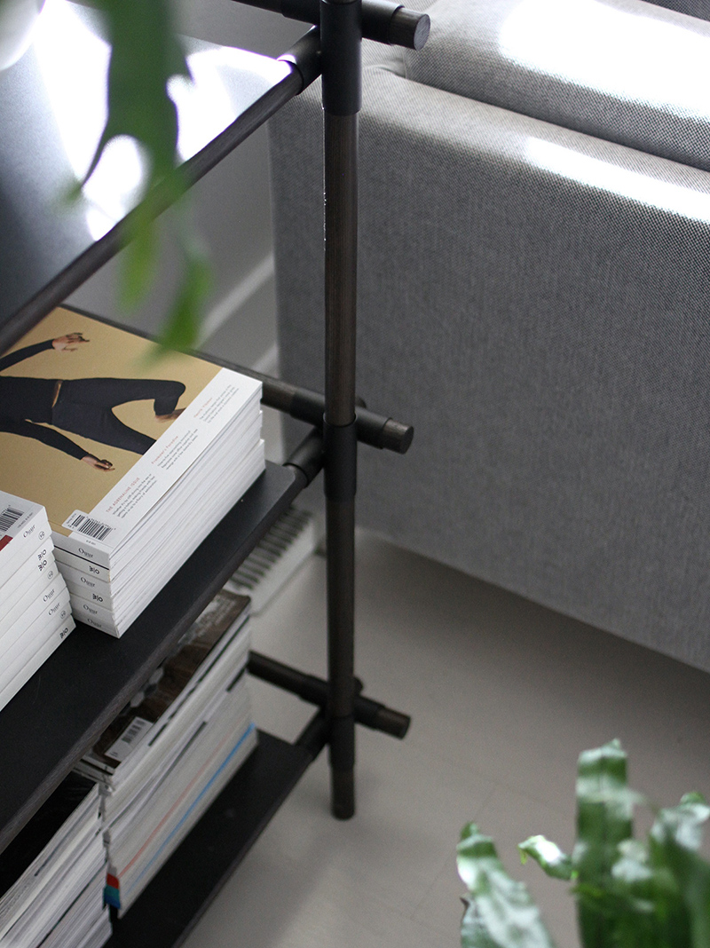
we love the versatility of the stick storage system... start small and build or reconfigure over time.  


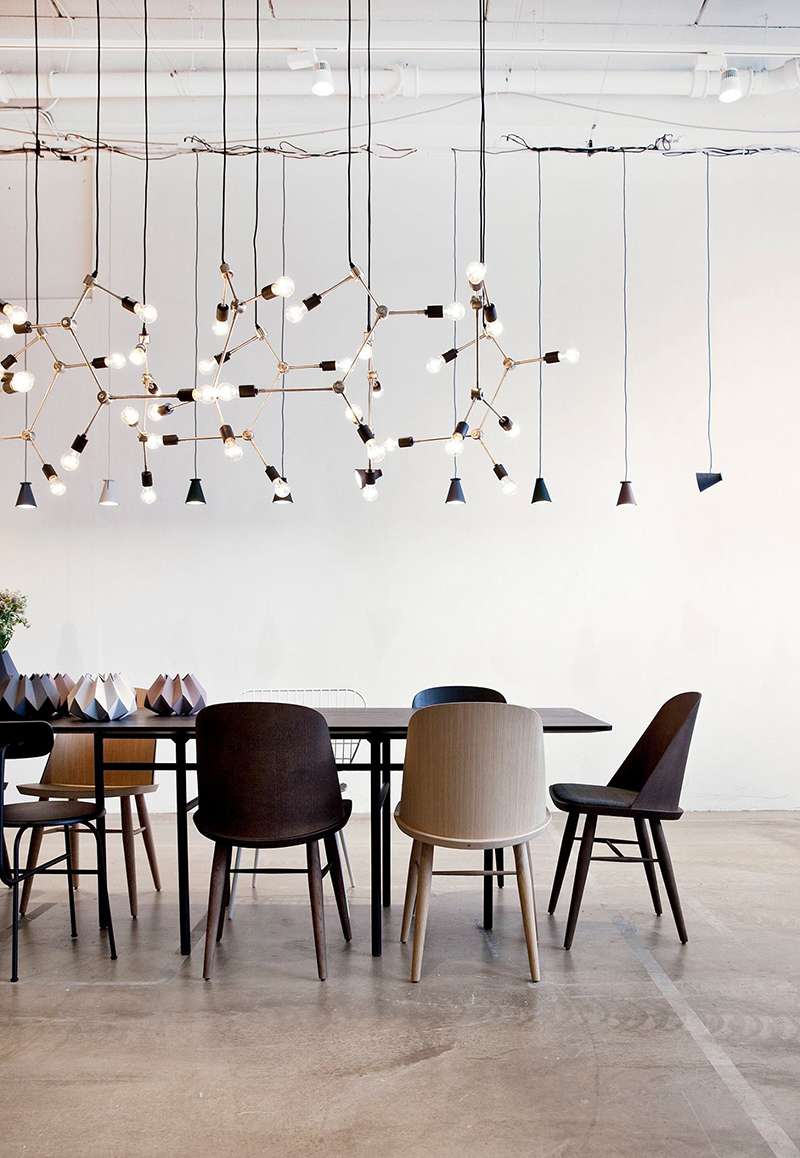
Gosh that Franklin Chandelier looks great massed together.   


Designed by Arne Jacobsen- who designed the swan chair amongst others- this reissue is one of our favourites.  


Saturday 27 February 2016

Anya Hindmarch...kitsch or just fun?

I have to admit though I think about buying something from Anya Hindmarch's new collections, their kitsch qualities have stopped me from doing so, though I am always tempted.

Take the mink scourer for example.


It's super cute and I could imagine it swinging off my Birkin but I would probably get sick of it.   

What about the featherwhite Ebury with the 'Dry Clean' pattern? 


I'm quite tempted by the backpacks-purely for practicality sakes but hmmm- not really sure about those either.  


The eyes are cute though.  


love the gif.   


Tuesday 23 February 2016

Fashion we're loving today- The Row

I think I am a little bit in love with The Row.  These are bits I would buy...


Caro draped cashmere and silk-blend cardigan


Monday 22 February 2016

We love a new product and Gubi's new mirrors by designer Gio Ponti are no exception.  
Gio Ponti was a conceptualist who always drew lines between the architecture and the interior design. Ponti never viewed architecture as simply creating buildings. Instead, he often conceived of the building's interior as well; creating furniture, lighting appliances, and even ceramics, glassware and silverware to fit the overall concept.

He even created Domus, an influential design magazine in Italy that made Italian design a leading influence on the world in the 20c.  

Ponti's signature furniture designs, such as the sleek Superleggera chair for Cassina or his elegant mirror collection provide a new perspective on traditional Italian furniture and blend style with functionality. His design was influenced by la dolce vita; he encouraged everybody to use good design to enjoy life to the fullest. This exact colourful, joyful, sensual Italian good life is reflected in his portfolio, and will certainly continue to influence artists and designers well into the future.

In 1925, Ponti designed his own house in Via Randaccio in Milan.   This was effectively his first full design project.   The circular Randaccio mirror hung in the bedroom of his apartment with other furniture designed for this project.  


Via Randaccio, Milano


Gubi has also produced the F.A 33 rectangular mirror, which he designed with his design partner, Pietro Chiesa for FontanaArte (still in existence) a furniture production firm he established in the 20s.   
images of products via gubi
You can read more about the products via the product pages in the store.  Follow the links below.    


Sunday 21 February 2016

what's new


First of all, me wish you all a happy year of the fire monkey.   Actually, the monkey is my sign and 2016 has already started off brilliantly!  It's going to be a great year.   


I've been contantly travelling.  We managed to fit in a ski trip to Zermatt which was fabulous!  Lots of great food and drink, as well as the skiing of course.   I injured my thumb which I never realised was so crucial to holding objects so am in a splint for 3 weeks....


Here's a pic of me and my number 1 guy a in front of the Matterhorn.  

Some cool new products have been released.  


Isn't this solid marble bathtub from kreoo magnificent?  The shape apparently echoes tibetan bells.   We just love the look of it.   It's carved from one solid marble block.  

We have been busy doing some ordering- the first on our list is the Randaccio mirror from GUBI designed by Gio Ponti.   


It has a light vintage feel and would look great in a hallway.    It also comes in a rectangular shape- perfect for someone's boudoir.   


Armadillo is famous for their neutral rugs- we love them.  They just introduced a new weave- the sherpa.   

It's available in 3 colours- sand (above)


pumice


Charcoal

Incredibly soft underfoot!  We love them.   

We also love this image of how they make the sierra rugs: 


Each individual part is hand made.   Glorious!  

We've been checking out some Jane Churchill fabrics-  

This geometric pattern on linen is really lovely-especially the blue colourway


This design comes in a printed velvet as well as a linen.   


This is probably my favourite- you all know I love a bit of ikat.   


This mottled fabric looks great from far away.   


love this one too.   


I usually find them a bit bland and conservative but I am loving the embroideries and the prices are great too.  

Finally, we have been working with an illustrator to produce fab images of our store and some of the pieces we stock.   Here's a sneak peek.   

Can't wait to share with you the rest of the images!  

Here's our new signature: so signing off.....


Friday 12 February 2016

Paint colours and all that

One of the most frustrating things about living in HK is the quality of the light.   As a designer, the colour of light can change the most beautiful of paint colours- so that the most subtle tones are rendered drab and lifeless.  

I love the subtlety of Farrow and Ball's paint colours from the UK.   Altfield used to carry the colours but no one ordered them (probably due to the crazy shipping prices).   However, I bit the bullet a few times and did make an order, only to be thoroughly disappointed with the results.  

However, though they didn't work in HK, it's nice to look at the new colours they introduce every season and dream.  


First up , Peignor 286, a soft subtle pink with a grey undertone.   It is inspired by the colour of chiffon dressing gowns.  You can't get more romantic than that!  

Love this colour, called Salon Drab 280.  


This is a classic 19th century drab which works well with yellows and reds.   

Love a toned down avocado green? - here is Yeabridge Green, named after the house in Somerset where it was originally found.  


Here's a lovely blue- Inchyra Blue (pronounced with a soft 'ch' like in China).   It can read as quite grey depending on the light and the juxtaposed colours.   


Remember the X-files?   They used to have an enigmatic character called Cromarty.  Alas, this colour is not named after him...Basically a neutral, it can sometimes read as blue.   


I'm quite fond of this colour. Called Worsted, it is inspired by a woollen fabric used for suits.  It reads as a clear grey.   


Drop Cloth can seem quite plain, but it is inspired by the plain cotton canvases that painters have put down to protect floors.  I like it with the wicker/straw/hide palette in the picture- I think it would work well with a scandi / heritage interior.    

Gosh, colour is an amazing thing- wish it worked better in HK.   


Friday 5 February 2016

Fabulous fabric patterns by Christopher Farr.

There are always some classic fabric patterns that look good anywhere.  One of our favourite fabric designers is Christopher Farr.
Here are a few of our favourites...you can source all these fabrics through us.


I'm not a huge fan of foliate patterns but this Christopher Farr design is one of my favourites.   It's called Carnival and the green and blue colourway is one of the classic combinations.   

Here's another by Christopher Farr- It's called Breakwater.   


It looks fabulous in a headboard or as wallpaper as shown here.   


This image is from one of Kit Kemp's hotels.  The pattern on the headboard is from the fathom series and the curtains on the windows are from the RickRack range.  Kit Kemp designed this fabric and it is really lovely.   Again the patterns are beautifully graphic with strong colours and a lovely transition of colours within the colourway.   I love the mix of patterns.    

We will be ordering some Christopher Farr fabrics soon and making them into cushions and some other small items.   Let us know if you are interested.